Improving the Digital Pharmacy Experience
In 2019, 58 million Americans reported the inability to pay for medications prescribed by their doctor in the past year. Blink Health aims to make prescription drugs more affordable, make prices more transparent, and improve the overall pharmacy experience. If we can order groceries on the internet and have them delivered to our door, then why can’t we do the same for our prescriptions? [Source]
DESIGN DIRECTION | UX/UI DESIGN | USER RESEARCH | DESIGN SYSTEM | UX COPYWRITING
The Problem
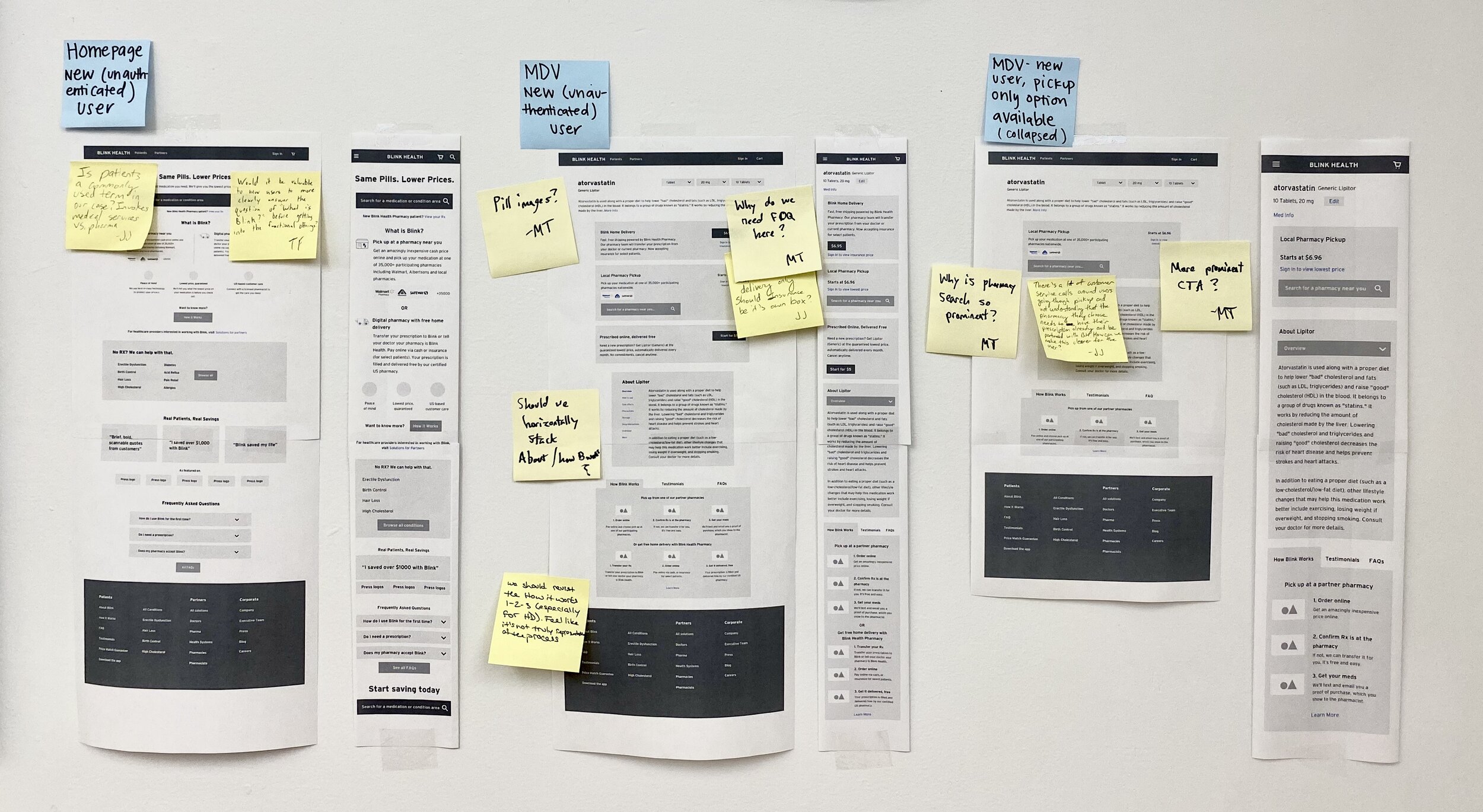
The patient experience was disjointed and inconsistent. Each method of getting a medication worked differently. The options weren’t clearly differentiated and the content was redundant. The page variations also resulted in designs and code that were complex and difficult to maintain. The mobile and desktop web pages were not responsive.
Background
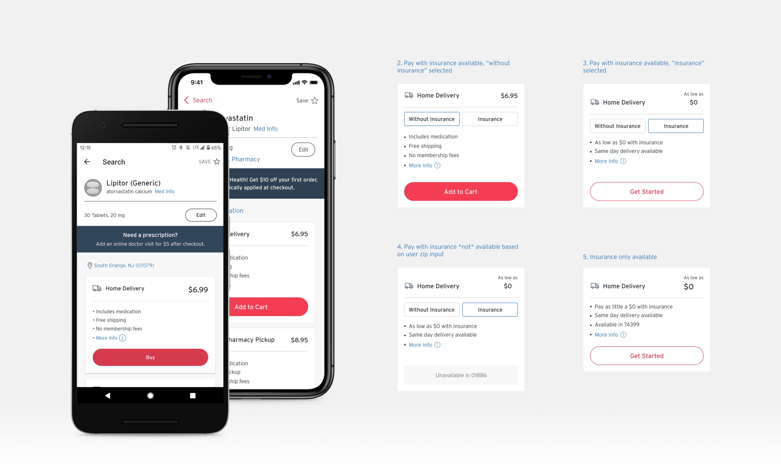
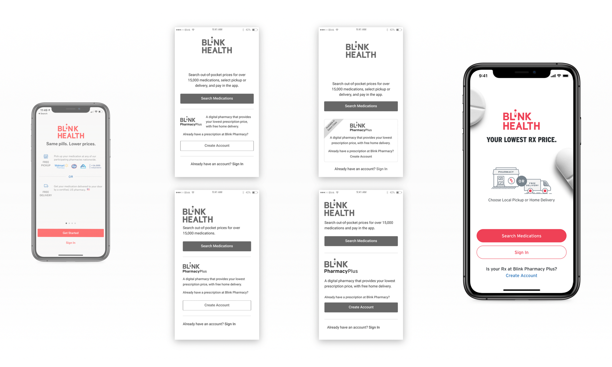
Blink, a health tech startup, has rolled out several ways to save on prescription drugs—pay online with local pickup, order online with home delivery, and complete an online doctor visit to get prescribed. Each combination of options resulted in a unique product page. We were also about to introduce the ability to pay with insurance, which meant a different customer journey.
The Challenge: How might we…
Introduce the new ability to pay with insurance?
Simplify the product experiences and drive consistency for patients?
Increase maintainability for the product and engineering teams?
My Role
Design direction for team of 3 product designers
UX/UI design of several screens
Updates to the Blink design system
Instituted iterative user research process
Before: Medication Pages
One of the first things my team did was take an inventory of existing medication page types and content. This desktop medication product page design was for a telemedicine-eligible medication. These mobile pages were also one-off designs—for telemedicine, local pickup only, and specialty brand drugs. They didn’t differentiate pricing options and there was a lot of redundant content on the page. Maintaining these unique page types was costly and introducing an insurance option would make the problem worse.
Getting Feedback on Initial Wireframes
Our analytics showed that the majority of users land on our product page (MDV: Medication Detail View) via Search (i.e., Google). We also needed to account for new patents who heard about Blink from their doctors and who might start on the home page.
After establishing the content needs for both pages, I led a design review with key stakeholders and had the team put wireframes on the wall for additional feedback. It’s important to take into consideration observations and ideas from cross-functional team members, including product, engineering, marketing, and operations.
Recording Our Observations
This is Elaine, a product designer on my team. In our first round of user research, we interviewed 8 participants in person. Together we wrote down our observations on sticky notes, focused around these key research questions:
What is the best way to present Blink’s value?
How do we organize our different purchasing options
How do we prioritize information and content hierarchy?
User Research: Observations to Insights
This slide from our research findings shows our process for synthesizing observations from the first round of research. We clustered them to identify patterns, then generated insights.
My team presented the user research findings to the entire product organization to begin building a body of knowledge about our patients’ behaviors and mental models.
Insights Identified
Most participants weren’t sure what the price included for each option (see design above)—”Is there a yearly membership fee?”, “Is the price a monthly fee?”, “Is start for $5 a delivery fee”?
Many participants didn't understand the telemedicine option and how it was different from regular home delivery.
While interested in paying with insurance, participants didn't think of using insurance as equivalent to other purchasing options.
Participants expressed doubt and uncertainty about whether or not Blink was safe to use and whether they could trust us.
Iterate: Revised Wireframe for Round 2 of User Research
This is a revised wireframe that one of the product designers on my team created for the second round of user research.
Each of the 3 designers on my team created a design alternative to explore a variety of ways to address the feedback from the first round. The primary goal was to differentiate the pricing and fulfillment options and to give patients the ability to compare and clarify what was included in the price.
High Fidelity Designs for Final Round of Research
A product designer on my team created this responsive high-fidelity design and a prototype for the final round of user research. We conducted moderated research with 6 participants. We wanted to validate that participants could explain the different services available to them on the product page. We also wanted to understand their expectations for what would happen after they added an item to their cart and explored their general attitude towards Blink after exploring the page.
Translating Designs to iOS/Android and Enumerating Card States
A product designer adapted the design to fit the iOS and Android platforms, primarily focusing on changes to the header. We also worked with the product manager to identify the various states that were needed for each pricing option card, creating the designs for each (some examples shown here).
Introducing Blink Pharmacy Plus
In addition to the medication product page, we needed to introduce the insurance option, Blink Pharmacy Plus, on the mobile app start screen. This was important for patients whose doctors sent in their first prescription and who just downloaded the app.
Here you can see the old start screen (left).
I designed several iterations of wireframes until I locked down the information hierarchy and prominence of Blink Pharmacy Plus (center).
I then finalized the UI design of the start screen, incorporating the latest brand guidelines and design system that my team was rolling out (right).
Outcome
Iterative User Research was a Key Factor in our Success
Participants were able to understand the different product offerings without prompting and commented that the site was straightforward and clear. They expressed enthusiasm for the products and several mentioned wanting to use it right away or recommend it to family members.
“I like the prices and convenience and ease. It’s not difficult to look at it and figure out what’s going on.”
“It’s clear. There are a lot of options.”
“I certainly would [use this]. It would be helpful to me because I spend a lot for medicine every month and that’s going through insurance.”
“My parents live in a small town and there aren’t good prices. My older sister handles most of their doctor stuff and I’m going to tell her to go check this website.”
Improved Modularity, Flexibility & Maintainability
The new medication product page design was a modular system, in which modules had the flexibility to be shown or hidden depending on a number of factors, including the user’s location, the particular medication, and the user’s signed-in state. From a code maintainability perspective, the rebuilt page was a single codebase with logic and UX copy being pulled from the backend. I instituted the use of a master copy doc, which was the single source of truth for all UX copy that contained all copy variations and states for developers to pull from.
Design System Evolution
The typography, colors, icons/illustrations, and visual grid followed the newly rolled out design system.
Typography: One of the key updates to our design system was a cross-platform typography system. The final system was implemented in a Sketch Library, the master copy of which was in Abstract.
I started by establishing the line-height as a foundation, moving to a more standard 4px baseline grid. Then I created each size based on a scaling factor, working with my design team and engineers to get it just right. The style names were established from the naming conventions from Apple’s Human Interface Guidelines, Android’s Material Design Guidelines, and standard web typography names.
The result was a system that was mapped from design to code—from Sketch, to Zeplin, to native code.
Next Steps
New product page design rolled out in locations where insurance option is available
New product page design is being A/B tested in the rest of the country
Monitor impact on funnel, through account creation, purchase, and prescription fill
Look for opportunities to optimize or A/B test copy
Learnings: A Retrospective
User research was successful and helped to document organizational processes
User research dry runs were successful (in person and remote)
Experiment with the checkout flow as we were exploring design alternatives
Use dedicated senior design resource for critical screen
Launch A/B test earlier
Lock down design system elements earlier